Today’s mapmaker is a mix of social scientist, field worker, graphic artist, and techie.
Looking for a more creative way to tell the stories of relief, recovery, and development, USAID—and in particular, the parts of the Agency that work in political transition and disaster response environments—have turned to such mapmakers and developed Geographic Information Units (GIU), expert teams of geospatial data analysts. The new USAID Geospatial Center is building on this foundation to increase spatial mapping capacity Agency-wide. The Agency uses cutting-edge technology to not only provide locations where USAID and other development organizations are working, but to better analyze its work.
Depending on the richness of available data, maps can feature various types of information, such as areas of conflict, ethnic/linguistic boundaries, economic statistics, and population density. The result is a graphic representation on paper—or on a screen—that can better inform disaster, relief, and transition programming.
For example, in March, the Agency worked with USAID’s mission in Haiti to map out work areas for rubble removal, clearly displaying areas where implementing partners were working throughout Port-au-Prince.
The process demonstrated that the Agency had been and continues to work in some of the hardest hit areas of the capital on post-earthquake cleanup. The map was subsequently shared with the United Nations, which received funding from USAID to start its own rubble removal activities as a way to avoid overlap.
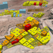
A second map showed the density of damaged and destroyed buildings in Port-au-Prince. The density map—created with data from the USAID-funded engineering firm Miyamoto, the U.N. Office for Project Services, and the Government of Haiti’s Public Works Ministry—was overlaid with the rubble map to show how USAID partners concentrated their efforts in areas with the most damaged buildings.
Together, the two maps led to a new awareness of the situation, creating a way to tackle and monitor the tons of rubble swamping the decimated capital city.
Disasters, Visualized
During the cholera outbreak in Haiti, USAID teams involved in the disaster response created maps that used daily caseload data to show the movement of the illness across the country, as well as the location of cholera treatment centers and oral rehydration points. These maps helped the DART, short for Disaster Assistance Response Team, based in Port-au-Prince rapidly mobilize assistance to target rural populations where caseloads were increasing.
In the aftermath of the recent earthquake and tsunami in Japan, USAID used geographic information system (GIS) technology to create maps that provided a visual representation of the effects of the tsunami. Knowing which prefectures were most affected by the tsunami, where the damaged nuclear power plants were located, and the affected population figures helped the DART—including 148 urban search and rescue personnel—better respond to the needs in the field.
For the Agency’s Office of U.S. Foreign Disaster Assistance, spatial thinking usually means creating maps that emphasize certain features of specific areas affected by catastrophe. These can range from general reference maps showing physical and man-made features or can highlight event-specific information such as earthquake intensity, cyclone paths, flood or fire extents, or the spread of an illness as was the case in Haiti. Technological advances are pushing the Agency to depict the effects of a disaster in near real-time, and satellites, smartphone, and open-source mapping allow for near real-time collection and dissemination of information in the middle of a disaster zone. They also make possible invaluable depictions of evacuation routes, key for effective early warning systems and disaster risk reduction, an important program focus.
Mapping a Legacy
Mapping isn’t just for high-profile emergencies, though. USAID continues to pursue new ways to leverage technology and apply spatial thinking to its work. For example, in Uganda in April 2011, a GIU staff member assisted the USAID mission with mapping and geographic analysis of a USAID program that was closing down after three years. The geospatial data analysts created maps showing the locations and types of activities, and presenting a holistic view of the program, in particular the infrastructure investments. The staff also mapped the results of an Agency-funded perceptions survey. Maps showed the effects of other USAID Office of Transition Initiatives activities in transition countries, like one visualizing a radio station’s increased broadcast area.
Part of the effort involved training the new geospatial staff at the USAID mission on best practices and new software, and providing them with geographic activity data to improve their understanding of current USAID programs that could benefit future infrastructure planning.
In the end, the maps are another visual tool to help USAID tell its story and carry out its mission.




Comment
Make a general inquiry or suggest an improvement.